Showing posts with label global warming. Show all posts
Showing posts with label global warming. Show all posts
Sunday, February 19, 2017
The simple truth: Coal-fired generators have no future in Australia
Lots of high quality energy and climate articles in he Australian press this week.
* The simple truth: Coal-fired generators have no future in Australia
Thursday, December 8, 2016
Australian Government killed emissions scheme despite knowing it could shave $15 billion off electricity bills
The Australian government seems to be copping a lot of bad press over their failed energy policies, backflipping on a rare attempt at common sense on carbon pricing earlier this week and now being asked to explain why they are keeping energy prices artificially high.
* Australian Government To Reintroduce Carbon Pricing ?
* Australian Government killed emissions scheme despite knowing it could shave $15 billion off electricity bills
Sunday, November 13, 2011
The Declines Incline
Sceptical Science has a very nice graphic showing how a global temperature decline, or series thereof, is confected from the obvious long term trend.
Going Down the Up Escalator, Part 1
Right now we're in the midst of a period where most short-term effects are acting in the cooling direction, dampening global warming. Many climate "skeptics" are trying to capitalize on this dampening, trying to argue that this time global warming has stopped, even though it didn't stop after the global warming "pauses" in 1973 to 1980, 1980 to 1988, 1988 to 1995, 1995 to 2001, or 1998 to 2005 (Figure 1).
As Figure 1 shows, over the last 37 years one can identify overlapping short windows of time when climate "skeptics" could have argued (and often did, i.e. here and here and here) that global warming had stopped. And yet over the entire period question containing these six cooling trends, the underlying trend is one of rapid global warming (0.27°C per decade, according to the new Berkeley Earth Surface Temperature [BEST] dataset). And while the global warming trend spans many decades, the longest cooling trend over this period is 10 years, which proves that each was caused by short-term noise dampening the long-term trend.
…
Other Physical Evidence of Continued Warming
It's also important to point out that global temperature measurements aren't our only evidence of the long-term global warming trend. We've observed many physical indicators of global warming (Figure 2).

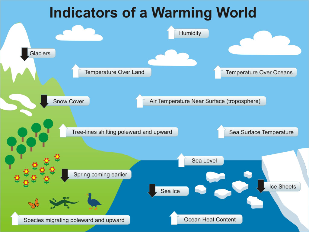

Figure 2: Physical Indicators of a Warming World
See the original post for a detailed account.
Thursday, September 8, 2011
The thin ice of modern life
(pinched from Peak Energy)
Scientific American has a post on the decline of arctic sea ice - Total Arctic sea ice at record low in 2010: study.

The figure above is from the Arctic Sea Ice Blog and shows [modelled] sea ice volume. The figure below (from The Cryosphere Today) shows the sea ice extent in millions of square kilometers.

The anomaly for this time of year is a loss of about 1.8 million square kilometers. What does that mean?
The maximum total sea ice area in winter is about 13 - 14 million square kilometers (also falling) or about 2 Australias. So the deficit in area at the end of the summer melt compared to the long term average is equivalent to 1 Queensland, 2 NSWs, 7 New Zealands or 20 Tasmanias.
Tassie often goes missing in stylised maps of Australia, but I think people might notice if Queensland did.
Scientific American has a post on the decline of arctic sea ice - Total Arctic sea ice at record low in 2010: study.
The minimum summertime volume of Arctic sea ice fell to a record low last year, researchers said in a study to be published shortly, suggesting that thinning of the ice had outweighed a recovery in area The study estimated that last year broke the previous, 2007 record for the minimum volume of ice, which is calculated from a combination of sea ice area and thickness.
The research adds to a picture of rapid climate change at the top of the world that could see the Arctic Ocean ice-free within decades, spurring new oil exploration opportunities but possibly also disrupted weather patterns far afield and a faster rise in sea levels.
The authors developed a model predicting thickness across the Arctic Ocean based on actual observations of winds, air and ocean temperatures. "The real worrisome fact is downward trend over the last 32 years," said Axel Schweiger, lead author of the paper, referring to a satellite record of changes in the Arctic.
"The real worrisome fact is downward trend over the last 32 years," said Axel Schweiger, lead author of the paper, referring to a satellite record of changes in the Arctic.
The researchers at the University of Washington in Seattle checked the model results against real readings of ice thickness using limited submarine and satellite data.
The approach has some detractors because it is focused is on modeling rather than direct observations of thickness, and therefore contains some uncertainty.
Sea ice area is easier to measure by satellite than ice thickness, and so has not needed a modeling approach.
The figure above is from the Arctic Sea Ice Blog and shows [modelled] sea ice volume. The figure below (from The Cryosphere Today) shows the sea ice extent in millions of square kilometers.
The anomaly for this time of year is a loss of about 1.8 million square kilometers. What does that mean?

The maximum total sea ice area in winter is about 13 - 14 million square kilometers (also falling) or about 2 Australias. So the deficit in area at the end of the summer melt compared to the long term average is equivalent to 1 Queensland, 2 NSWs, 7 New Zealands or 20 Tasmanias.
Tassie often goes missing in stylised maps of Australia, but I think people might notice if Queensland did.
Friday, August 12, 2011
Public Receptive to Peak Oil Debate and Policy Ideas - Survey
This is a guest post from Denis Tegg.
It's a common misconception that only "greenies" and "doomsters" are concerned about peak oil. This view perhaps explains why politicians and the mainstream media have marginalised or ignored the issue. However a recent US survey of public opinion reveals that, in fact, those Americans who identify themselves as "very conservative" politically or who are "strongly dismissive" of climate change are among those most concerned that rising fuel prices are harmful to the economy and public health.
Overall nearly 2/3rds -- or 65% -- of all respondents to the US survey said that if oil prices triple it would be "very harmful" to the economy, and 44% said it would be "very harmful" to public health.
These are the key findings of a study published online this week at the American Journal of Public Health.
Here is the breakdown by idealogy - note: those who identified themselves as "very conservative" were 20% more concerned than those who said they are "very liberal"

and here is the breakdown by views on climate change - ( strong concern about peak oil from those who are dismissive of climate change is not an endorsement many would wish for, but it indicates that when peak oil is couched in immediate economic terms, then climate sceptics are almost as worried about oil prices as those who are alarmed about climate change )

New Zealand Poll
The US survey findings aligns closely with a poll carried out by WWF in New Zealand in August 2010. In that poll 72% of New Zealanders believe it is the government's task to plan ahead, and invest now in public transport and alternative fuels before the price of oil rises. The NZ survey did not break down opinion among “liberals” and “conservatives” but it seems likely that ideological results would be similar here. Further polling and focus group surveys would be useful.
Latent Unease
For some time I have sensed a general feeling of unease in the public about oil prices, particularly since the latest spike began in late 2010, so soon after the 2007 -- 08 oil shock. There is a sense that this is not "normal", but for most people they cannot quite put their finger on the reasons for fuel prices rising and being so volatile. This latent sense of unease is confirmed in the US study's conclusions where they say -
What are the takeout messages from the US and New Zealand opinion surveys?
To me they are --
1 there is a broad consensus across the political divide that peak oil/oil price shocks are dangerous and damaging to people's well-being and the economy
2 to a far greater extent than previously thought "middle New Zealand" as well as those identifying themselves “far left" and the "far right" are open to engagement and debate on peak oil and its implications, from both the media and politicians.
3 there is sufficient concern to indicate that the public are already receptive to the major political parties proposing bold policies to lower our dependency on imported oil and as to how we might transition to alternative sources.
Will politicians and media have the courage?
probably not. As Dave Allen colourfully puts it -
It's a common misconception that only "greenies" and "doomsters" are concerned about peak oil. This view perhaps explains why politicians and the mainstream media have marginalised or ignored the issue. However a recent US survey of public opinion reveals that, in fact, those Americans who identify themselves as "very conservative" politically or who are "strongly dismissive" of climate change are among those most concerned that rising fuel prices are harmful to the economy and public health.
Overall nearly 2/3rds -- or 65% -- of all respondents to the US survey said that if oil prices triple it would be "very harmful" to the economy, and 44% said it would be "very harmful" to public health.
These are the key findings of a study published online this week at the American Journal of Public Health.
Here is the breakdown by idealogy - note: those who identified themselves as "very conservative" were 20% more concerned than those who said they are "very liberal"

and here is the breakdown by views on climate change - ( strong concern about peak oil from those who are dismissive of climate change is not an endorsement many would wish for, but it indicates that when peak oil is couched in immediate economic terms, then climate sceptics are almost as worried about oil prices as those who are alarmed about climate change )

New Zealand Poll
The US survey findings aligns closely with a poll carried out by WWF in New Zealand in August 2010. In that poll 72% of New Zealanders believe it is the government's task to plan ahead, and invest now in public transport and alternative fuels before the price of oil rises. The NZ survey did not break down opinion among “liberals” and “conservatives” but it seems likely that ideological results would be similar here. Further polling and focus group surveys would be useful.
Latent Unease
For some time I have sensed a general feeling of unease in the public about oil prices, particularly since the latest spike began in late 2010, so soon after the 2007 -- 08 oil shock. There is a sense that this is not "normal", but for most people they cannot quite put their finger on the reasons for fuel prices rising and being so volatile. This latent sense of unease is confirmed in the US study's conclusions where they say -
"although Americans are unlikely to be aware of the concept of peak petroleum, the level of expert agreement on the issue, or the potentially significant impacts on society, the public does possess a latent sense of an impending energy problem"
What are the takeout messages from the US and New Zealand opinion surveys?
To me they are --
1 there is a broad consensus across the political divide that peak oil/oil price shocks are dangerous and damaging to people's well-being and the economy
2 to a far greater extent than previously thought "middle New Zealand" as well as those identifying themselves “far left" and the "far right" are open to engagement and debate on peak oil and its implications, from both the media and politicians.
3 there is sufficient concern to indicate that the public are already receptive to the major political parties proposing bold policies to lower our dependency on imported oil and as to how we might transition to alternative sources.
Will politicians and media have the courage?
probably not. As Dave Allen colourfully puts it -
"In a country run by responsible adults, these prudent warnings based on the best available science -- would be blaring from every political and cultural orifice. In a country run by amoral, narcissistic, opportunists, they are whispered at the fringes – in the hushed politeness of power-point presentations, on fringe websites, in meagerly-read books, and among small groups of alarmed citizens."
Wednesday, August 3, 2011
The Minister's Chartjunk in the NZ ETS Review 2011
This is a guest post from Robin Johnson's Economics Webpage.
This evening I was intending to carefully read the Report on the New Zealand Emissions Trading Scheme that Minister for Climate Change Issues Nick Smith released today and write a considered review.
However, I only got as far as Nick Smith's forward on the the third page when I got stopped in my tracks by Figure 3, a misleading piece of chartjunk if I ever saw one, about New Zealand being on target to meet its obligations under the Kyoto Protocol. Here it is.

Fig 3 New Zealand's net Kyoto greenhouse emissions 2000 2012
The chart legend says it shows "Kyoto net emissions (actual emissions)". This parameter trends upward to 2007 and then in 2008 and 2009 it suddenly drops below the blue line of NZ 1990 emissions. Thus showing we are meeting our emissions reduction committment that we signed up in the Kyoto Protocol. Its enough to make you proud to be a Blue-Green.
This chart is junk because it misrepresents the underlying data on greenhouse gas emissions. Back to the legend: "Kyoto net emissions (actual emissions)". Why does it say "actual emissions" in brackets? Because Smith would like you to think that. Lets look at real chart of real New Zealand greenhouse gas emissions.

NZ Total GHG emissions 1990 to 2012
This shows total real emissions up to 2007 and predicted emissions 2008 to 2012 - the green line. It looks nothing like Fig 3. The actual and predicted trend does not show a return to 1990 volumes of emissions. However, that legend also said net emissions, that is total or gross emissions in any year less carbon absorbed by forests. Maybe Fig 3 is based on net emissions.

NZ Gross and Net GHG emissions 1990 to 2012
The trend in net emissions (total less forest sink removals) or the blue line shows an even steeper rate of increase than the total emissions. So how can Fig 3 show that New Zealand reduced emissions to 1990 volumes? Two more clues are in Figure 3. The title is "Kyoto net" and there is a note under the data source says "Kyoto net 2000-2007 values are backcasted". So the Fig 3 data is not just "net", it is also "Kyoto net" and "backcasted". What does ''backcasted" mean? Another chart shows how Smith gets to Fig 3 from the real total and net emissions data.

NZ Kyoto calculation 1990 to 2012
Greenhouse gas emissions, as defined for compliance with the Kyoto Protocol, are gross from 1990 to 2007, and once the Kyoto committment period starts in 2008, an Annex B country like New Zealand can meet its target by deducting removal units issued for carbon sinks - so Kyoto-defined emissions go net from 2008. Hence the red line. The removal units issued for afforestation (the increase in carbon stock in a forest planted since 1990) appear as if from nowhere in 2008 and disguise the growth in both the gross and net emissions.
This isn't new information. In 1997, Simon Upton, the Minister for Climate change in Jim Bolger's 1990's National Government spoke of New Zealand's position at the UNFCCC talks; "if sequestration is treated in the way New Zealand has long been advocating, then the major contribution we expect to make to removing carbon from the atmosphere..will earn us 'credits' ".
Interestingly, Upton had this cautionary note: "It might be suggested that New Zealand's interest in sinks stems purely from a desire to secure for itself a large buffer that would allow for significant growth in greenhouse gas emissions". Upton believed that would not be a credible policy.
However, since Upton's day, the chartjunk that is Figure 3 indicates that New Zealand's climate change policies have consistently been all about providing exactly that buffer to allow for significant growth in greenhouse gas emissions while claiming to have mitigation policies such as the NZ ETS that match our much-abused clean green overseas image.
This evening I was intending to carefully read the Report on the New Zealand Emissions Trading Scheme that Minister for Climate Change Issues Nick Smith released today and write a considered review.
However, I only got as far as Nick Smith's forward on the the third page when I got stopped in my tracks by Figure 3, a misleading piece of chartjunk if I ever saw one, about New Zealand being on target to meet its obligations under the Kyoto Protocol. Here it is.
Fig 3 New Zealand's net Kyoto greenhouse emissions 2000 2012
The chart legend says it shows "Kyoto net emissions (actual emissions)". This parameter trends upward to 2007 and then in 2008 and 2009 it suddenly drops below the blue line of NZ 1990 emissions. Thus showing we are meeting our emissions reduction committment that we signed up in the Kyoto Protocol. Its enough to make you proud to be a Blue-Green.
This chart is junk because it misrepresents the underlying data on greenhouse gas emissions. Back to the legend: "Kyoto net emissions (actual emissions)". Why does it say "actual emissions" in brackets? Because Smith would like you to think that. Lets look at real chart of real New Zealand greenhouse gas emissions.
NZ Total GHG emissions 1990 to 2012
This shows total real emissions up to 2007 and predicted emissions 2008 to 2012 - the green line. It looks nothing like Fig 3. The actual and predicted trend does not show a return to 1990 volumes of emissions. However, that legend also said net emissions, that is total or gross emissions in any year less carbon absorbed by forests. Maybe Fig 3 is based on net emissions.
NZ Gross and Net GHG emissions 1990 to 2012
The trend in net emissions (total less forest sink removals) or the blue line shows an even steeper rate of increase than the total emissions. So how can Fig 3 show that New Zealand reduced emissions to 1990 volumes? Two more clues are in Figure 3. The title is "Kyoto net" and there is a note under the data source says "Kyoto net 2000-2007 values are backcasted". So the Fig 3 data is not just "net", it is also "Kyoto net" and "backcasted". What does ''backcasted" mean? Another chart shows how Smith gets to Fig 3 from the real total and net emissions data.
NZ Kyoto calculation 1990 to 2012
Greenhouse gas emissions, as defined for compliance with the Kyoto Protocol, are gross from 1990 to 2007, and once the Kyoto committment period starts in 2008, an Annex B country like New Zealand can meet its target by deducting removal units issued for carbon sinks - so Kyoto-defined emissions go net from 2008. Hence the red line. The removal units issued for afforestation (the increase in carbon stock in a forest planted since 1990) appear as if from nowhere in 2008 and disguise the growth in both the gross and net emissions.
This isn't new information. In 1997, Simon Upton, the Minister for Climate change in Jim Bolger's 1990's National Government spoke of New Zealand's position at the UNFCCC talks; "if sequestration is treated in the way New Zealand has long been advocating, then the major contribution we expect to make to removing carbon from the atmosphere..will earn us 'credits' ".
Interestingly, Upton had this cautionary note: "It might be suggested that New Zealand's interest in sinks stems purely from a desire to secure for itself a large buffer that would allow for significant growth in greenhouse gas emissions". Upton believed that would not be a credible policy.
However, since Upton's day, the chartjunk that is Figure 3 indicates that New Zealand's climate change policies have consistently been all about providing exactly that buffer to allow for significant growth in greenhouse gas emissions while claiming to have mitigation policies such as the NZ ETS that match our much-abused clean green overseas image.
Friday, May 6, 2011
IPCC renewables report out soon.
Reuters has had a preview of an upcoming IPCC report on the impacts of renewables on climate change mitigation.
Renewable energies to leap, costs fall: U.N.
Renewable energies such as wind or solar power are set to surge by 2050, and expected advances in technology will bring significant cost cuts, a draft United Nations report showed on Wednesday.
The most comprehensive U.N. overview of the sector to date said renewables excluding bioenergy, which is mainly firewood burned in developing nations for cooking and heating, could expand by three to 20 times by mid-century.
"The cost of most renewable energy technologies has declined, and significant additional technical advancements are expected," the Intergovernmental Panel on Climate Change (IPCC) said in a draft obtained by Reuters, based on a review of 164 scenarios.
In 2008 renewable energy production accounted for about 12.9 percent of global primary energy supply and was dominated by bioenergy with 10.2 percent, followed by hydro power, wind, geothermal, solar power and ocean energy.
The projected expansion is likely to continue even without new measures to promote a shift from fossil fuels as part of a U.N.-led fight against climate change, it said.
Wednesday, February 23, 2011
Saving Solar From The Floods (Levy)
The federal government's proposed new "flood levy" to pay for cleaning up after the Queensland floods had a number of flaws (even ignoring the fundamental injustice of making regular taxpayers foot the whole bill leaving business untouched), chief among them the axing of a number of alternative energy programs.
The Greens (with support from GetUp) seem to have managed to block at least one of the cuts, with the "solar flagships" program getting a reprieve (the bill has passed the house of reps but still remains stuck in the Senate).
PM Gillard originally tried to claim the programs were unnecessary given her intention to put a cost on carbon emissions one day - given the governments failure to do this in its first term (and the general inadequacy of the CPRS bill they put forward back then) its unsurprising people want to keep the programs in place.
The ABC has a look at the issue - Gillard is gambling with her climate credibility.
The Greens (with support from GetUp) seem to have managed to block at least one of the cuts, with the "solar flagships" program getting a reprieve (the bill has passed the house of reps but still remains stuck in the Senate).
PM Gillard originally tried to claim the programs were unnecessary given her intention to put a cost on carbon emissions one day - given the governments failure to do this in its first term (and the general inadequacy of the CPRS bill they put forward back then) its unsurprising people want to keep the programs in place.
The ABC has a look at the issue - Gillard is gambling with her climate credibility.
AT HER RECENT NATIONAL Press Club address, Prime Minister Julia Gillard rationalised Labor's decision to cut its investment in renewable energy to fund the flood levy on the basis that these policies "are no longer necessary" with a carbon price. Last week, addressing the Committee for Economic Development of Australia, Gillard argued that "a carbon price will drive another sweeping technological revolution like Information Technology did in the 1980s and 90s."
Both cases reveal that those advising the PM grossly misunderstand climate and energy policy.
Subscribe to:
Posts (Atom)